![]() So I did a little work on a re-imagined version of the Adobe Creative Cloud logo however I did completely from scratch without their logo constraint option to try and get things moving to see if it would branch off to other thoughts. However due to time limitations from having to design the Project Plan to presentation a few days later there wasn’t much time to do any work to show.
So I did a little work on a re-imagined version of the Adobe Creative Cloud logo however I did completely from scratch without their logo constraint option to try and get things moving to see if it would branch off to other thoughts. However due to time limitations from having to design the Project Plan to presentation a few days later there wasn’t much time to do any work to show.
Especially since the project plan is more academic and data focused, less so on actual work being done for the competition. Which is fine, it just means I’ll have to do the creative aspect of it after the presentation on Tuesday.
Conclusion
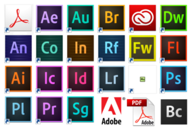
Overall this logo is very over-simplified, and as a logo or icon may not work. Especially since the other logo’s work off a square I’m thinking the logo I do submit to the competition should have a square version as well as they wanted this campaign/design to be holistic with their other brands/campaigns (as shown above). However (as shown below) if we redesigned the rest of the creative cloud to have round logo’s that’s the only that logo would really fit in. Since I’m not being asked to redesign the rest of the cloud logo’s I’ll just leave it as an option and not have it as my main pitch/design.

Though the logo does include a cloud and I tried to retain the flat design (not adding too much depth to the logo). Though it’s not great it’s a good starting point and it was made on Adobe Illustrator so the practice was very useful for when I do the actual logo. I’ll be using this in my presentation tomorrow to show some of my design thought processes so for whilst approaching this competition.
